Most homeowners start with what they like. Blue feels calm. Beige feels safe. Dark tones feel bold. However, color does more than show taste. It shapes behavior, sets mood, and guides how people move through a space. In luxury homes, color psychology design turns color into a tool, not just a look. Calm and cohesive spaces use this approach instead of chasing bold statements. When homeowners learn this early, they make better choices. Confidence grows before they pick finishes. If direction still feels unclear, a short conversation through the contact page can help set the path.
This guide explores how color psychology influences luxury home design and why it matters far more than trends.
How Color Psychology Design Sets Emotional Expectations
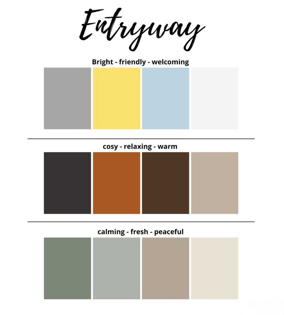
Before anyone notices materials or details, color establishes how a space feels. Light, neutral palettes often signal calm and openness. Deeper tones can create intimacy, focus, or grounding.
Luxury homes that feel effortless rarely rely on dramatic contrast at the entry. Instead, they use restrained color to lower sensory noise and allow the home to unfold gradually. This approach makes spaces feel intentional rather than overwhelming.
Why Neutral Tones Matter in Color Psychology Design
Neutral palettes are often misunderstood as safe or unimaginative. In reality, neutrals are powerful because they allow texture, proportion, and light to take center stage.
In luxury interiors, neutral does not mean flat. Subtle shifts in undertone, warmth, and depth create richness without distraction. Homes that age well often rely on layered neutrals rather than trend-driven color statements.
Why Color Psychology Design Affects Perceived Space and Scale
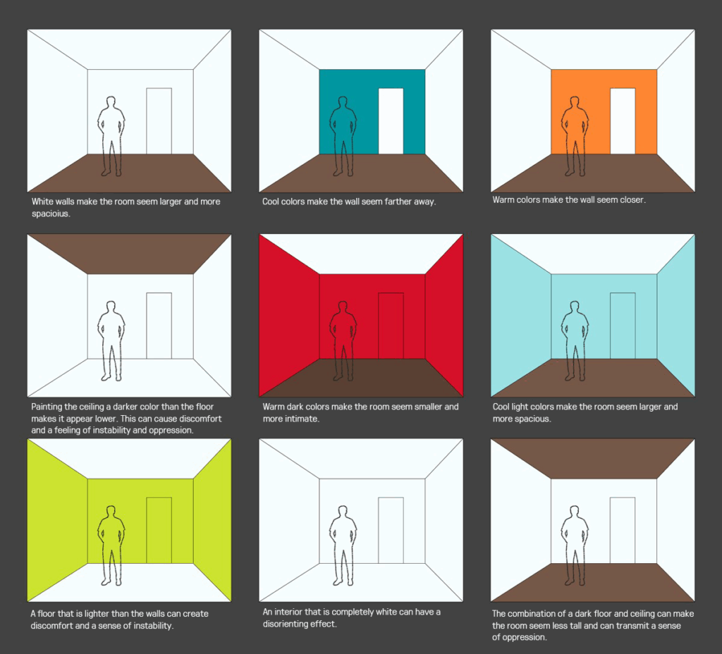
Color affects how large or small a space feels. Lighter tones tend to expand rooms visually, while darker tones can make spaces feel more intimate or grounded.
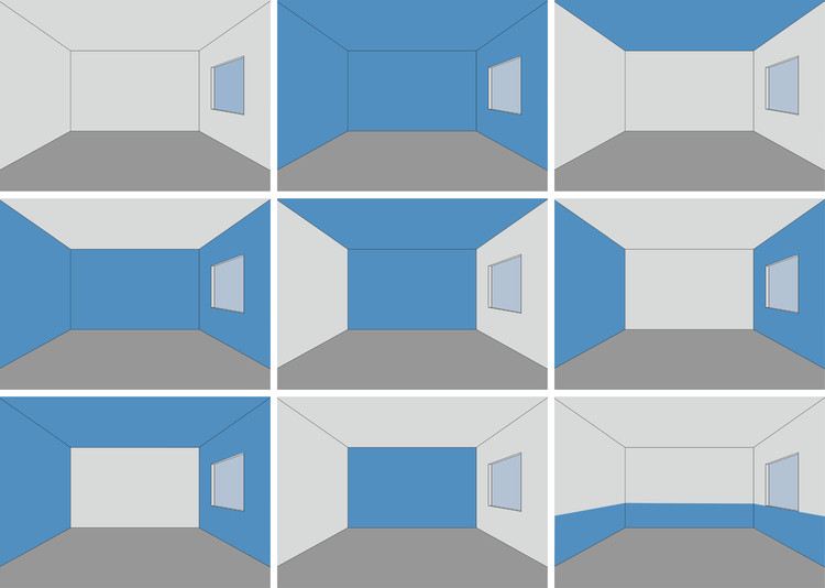
In homes with open layouts, color consistency helps maintain flow. In more segmented homes, strategic contrast can define zones without fragmenting the overall experience. When color supports the architecture, rooms feel proportionate rather than accidental.
The Role of Color Psychology Design in Light and Space
Natural light behaves differently depending on color. Warm tones soften daylight and create comfort. Cooler tones sharpen it and emphasize clarity.
Luxury homes often succeed because color choices are made in relationship to light exposure, orientation, and time of day. Rooms that feel balanced morning through evening are rarely the result of chance.
This is a natural point where you can add an internal link related to interior design, paint selection, or services, depending on how you want to guide the reader.
The Difference Between Trend Color and Timeless Color
Trends move quickly, but homes do not. Colors that feel exciting online may feel dated once lived in.
Timeless color choices tend to sit slightly quieter. They support furniture, art, and architecture rather than competing with them. This does not mean avoiding personality, it means expressing it with restraint.
How Experienced Designers Think About Color First, Not Last
One of the patterns teams like Next Gen Design Group see across Orange County homes is that color decisions made late often feel disconnected. When color is treated as a finishing step, it ends up compensating for unresolved layout or lighting issues.
Tommy, the owner of Next Gen Design Group, often notes that the most successful projects establish a color direction early. When color is aligned with layout and light from the beginning, the home feels cohesive rather than assembled.
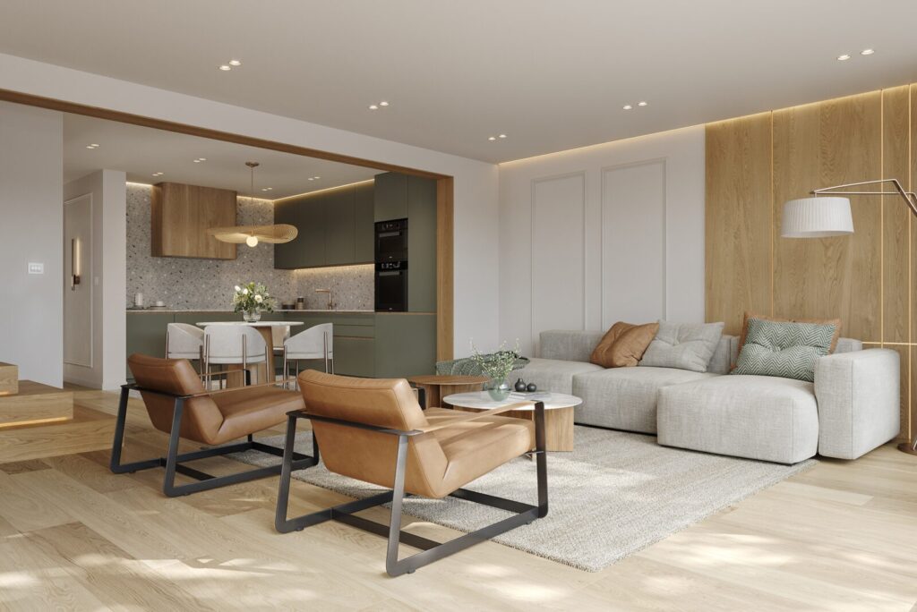
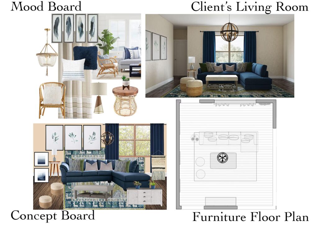
Color and Buyer Perception in Luxury Homes
Color also affects how homes are perceived by others. Even homeowners not planning to sell benefit from understanding this.
Balanced, thoughtful color palettes tend to read as higher quality and more intentional. They allow buyers or guests to imagine themselves in the space rather than reacting to bold personal statements.
Frequently Asked Questions
Q: Does color really matter that much in luxury homes?
A: Yes. It shapes mood, perception, and long-term satisfaction.
Q: Are bold colors a mistake?
A: Not always, but they should be used intentionally and sparingly.
Q: Should color be chosen before finishes?
A: Often yes. Color direction helps guide material selection.
Q: Do trends matter at all?
A: They can inform choices, but they should not dictate them.
Designing With Intention, Not Impulse
Color drives how a luxury home feels, not just how it looks. Strong palettes cut visual noise. They boost light and help rooms work better. Homeowners who understand the psychology behind color make smarter choices, and feel confident years later. If you plan design updates and want to see how color will shape your home, pause before you grab samples. Step back first. That clarity starts with one focused conversation through the contact page, long before any paint goes on.